Trends come and go. And just like
we adjust our hairstyles and clothing to stay with the times, so should a
company adjust their branding.

When Maloney & Porcelli was
launched in 1996, it became the after-work watering hole for Midtown
businessmen looking to charge $50 steaks to their expense accounts. Over the
years, the heat of M&P has cooled significantly, and according to the NY Times, M&P will be the next NYC
restaurant to take the plunge into a re-design. The restaurant has always
had the look and feel of an old Manhattan club, and has attracted a crowd of
investment bankers with Ivy legacies. And while this look seemed all too
fitting in the economic growth and subsequent “golden age” of the 90′s, it’s
become a bit outdated in 2012, especially when the trend now is modern and
minimal. Father and son duo, Alan and Michael Stillman, are taking the
restaurant into the 21st century and updating it with a “Mad-Men” feel that is
ever so appropriate, considering the restaurant’s proximity to so many Madison
Ave. agencies. M&P’s massive pork shanks came to signify 90′s excess, and
while the pork shanks remain, not much about the restaurant is the
same. The design is fresh and sleek, and still feels the same as
the original M&P. The trick here is updating, not changing. Instead of
redoing the interior entirely, a few changes in décor (as well as a greatly
updated menu) would suffice. Only time will tell if the Stillman’s are
able to return M&P to it’s 90′s glory, but we’re really liking what we have
seen of the re-design so far.
The aim of a successful re-brand
is to adapt to meet a changing world, not to completely redo your image. A
subtle facelift of a brand is necessary every 5 to 10 years if you wish to
remain current, and is to be expected of most companies. However, a major
overhaul of a brand can result in one of two things: either your brand is
viewed in a completely new light by customers and business flourishes, or
you create an image that is unrecognizable to your customers and you return to
the initial logo.
Unfortunately, this was the case
for The Gap, who fell victim to the latter of these two instances when their
logo appeared in Helvetica with a blue box in the upper right corner. The logo
was a flop, primarily because of the poor design, but also because there was
nothing recognizable about the logo. Albeit, the box in the corner was a nod to
the original “GAP in the box”, but the shade of blue used in the re-design
didn’t even match the former logo and was completely off-brand. Naturally, this
re-design was met with a tremendous amount of backlash from the design community
and The Gap promptly returned to their old logo. To create a happy medium,
their old logo, which has become iconic in its simplicity, now appears in
conjunction with Helvetica signage, keeping with the visual language of their
“1969″ line, but still maintaining the original look and feel of Gap stores.
In most instances, a complete
re-design is not necessary, as is the case for Starbucks, Mercedes, and Apple.
For these companies, a simple logo change and typeface adjustment every 10
years is sufficient to remain relevant in a competitive market. But that is
largely because these brands are already so iconic and relevant (not to mention
successful) that a complete image revamp isn’t necessary.
A perfect example of a subtle
re-design would be MTV’s logo, which, aside from a few minor changes here and
there, has remained pretty much the same since it was created. The logo as it
appears now is a cropped version of the original, appearing usually with video
playing in the letter M, and TV is in knockout white. Very on trend and very
modern. The outline was removed around the outer edge of the letter V, which
made the logo feel light and airy. Because the name MTV is so iconic (and
because MTV no longer actually plays music videos), it only seemed logical to
remove the words “Music Television” from the bottom of the logo. This re-design
is so successful because it is more relevant and modern, without any real changes
to the logo.

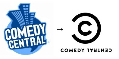
When 2010 arrived, Comedy Central
realized how outdated, and well… 90′s, their logo looked compared to the
recently updated logos of the other TV networks. As a result, they completely
scrapped their old design for a more modern, typographic interpretation of the
Comedy Central brand. The “little c within a big C” was a really fresh
departure, but forms the same circular shape as the globe in the former
logo. They chose a completely new typeface, and flipped “CENTRAL” upside down,
probably alluding to the twisted nature of the comedy featured on the network.
The logo was met with some criticism, but overall the transition from the old
aesthetic to the new one did not affect them adversely, and has garnered a lot
of positive feedback.

The lesson to be learned here is again,
less is more, and that subtle changes to existing branding may be all that is
necessary to update a company’s look. The goal of a re-design is to freshen a
look, not to completely change it. In many cases, new branding may go
practically unnoticed. And always remember: a re-design should always capture
the feel of your brand.
Studio
K&M is a full-service design and concept firm based in New York,
skilled in graphic and web design, art direction, identity development,
usability and social media. This article was mentioned on the New York Times
website in their “What We’re Reading” column. You can can follow
Studio K&M on Twitter @StudioKandM.
No comments:
Post a Comment